If you want to make an apple pie from scratch, you must first create the universe.
The menus for an RPG are absolutely integral to the game and they make use of a lot of game data. Want to display the party? Well you need a list of party members, each member needs an avatar and they need stats and levels and experience. Every part of the menu relies on a big chunk of the game already existing! But that's not a problem, I only need a small subsection of the menu for this part of the book and I can lock off the rest until we're ready for it.
RPG menus are commonly made of backing panels. These panels are a pain to position. I had some helper code but it wasn't clear and easy enough. Therefore I decided to create a special piece of code, just for handling these panel layouts which makes it far easier to build up the menu screens.
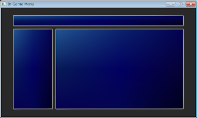
Here's my current menu:
This is somewhat hardcoded. I create the top title panel first offset from the top of the screen. Then I created the menu panel the length of the screen, then reduced it by the height of the time/gold panel. Finally I work out the position of the party panel offseting it from the menu panel. It's kind of a pain in the ass and even with my offset helper functions, there's a lot of manual calculation.
After I finished the above screen, I started on the item screen and quickly realised I needed an easier way to construct these menu and so I created a class called PanelLayout which starts with a panel that fills the entire screen.
I don't want the menu to take up the full screen, I want some nice padding around it. Therefore I contract the screen panel by calling PanelLayout:Contract("screen", 80, 40) , 80 pixels of padding on the horizontal and 40 on the vertical.
Next I want to make the title bar at the top, so I cut this panel into two pieces using the command SplitHorz("screen", "top", "bottom", 0.13, 4) which means split the screen panel into two panels called top and bottom. Do the split 13% from the top and have 4 pixels of spacing between these two child panels.
Then I do a vertical split to separate out the menu and party panels. SplitVert("bottom", "left", "party", 0.76, 4)
One final split, pl:SplitHorz("left", "menu", "gold", 0.7, 4), for the gold box and we've got the desired layout, in around 4 lines of code. Far better than my initial attempt!
I'm going to continue and flesh out the menu with the appropriate layouts for each screen and then add a little functionality where necessary.
If this post has caught your interest and you'd like to know more about the book I'm writing please check out the promo site here.


No comments:
Post a Comment